![fusion-graph-white (1).png]](https://fusiongraph.resulting-it.com/hs-fs/hubfs/fusion-graph-white%20(1).png?height=40&name=fusion-graph-white%20(1).png)
The Card View within FusionGraph can be used to provide a hierarchical view of layer data items. This can be very useful in visualizing things like Business Process data.
You can easily navigate, edit and export data from a selected layer. Also, you can easily see the layer's classifications and related layers, making it a perfect tool to build and maintain a Business Process Framework.
How to add Layers or subset of data
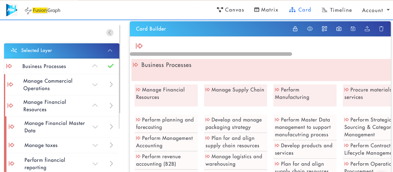
Navigate to the required layer within the Org/Fact/Plan Graph and click to add the layer plus two levels of child items to the Card Builder area.
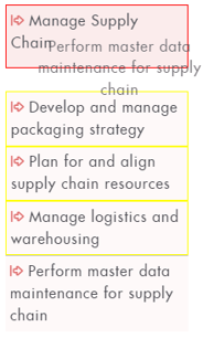
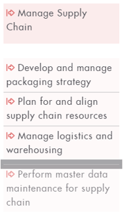
To focus the view on a specific subset of the hierarchical data, navigate to the parent of that subset by using down arrows 
Removing the Layer
When the card builder is populated, to remove the added layer (and clear the card view) you can either click the green tick 
Creating & Editing Items
You can create new items for both the loaded layer and other layers by clicking the layer icon 
Double-clicking a card will open the properties to edit even when the card builder is locked, as the lock is to prevent cards from being moved or classified unintentionally.

Within the card’s properties you can maintain the item’s data and make connections to other items via the connection tab 
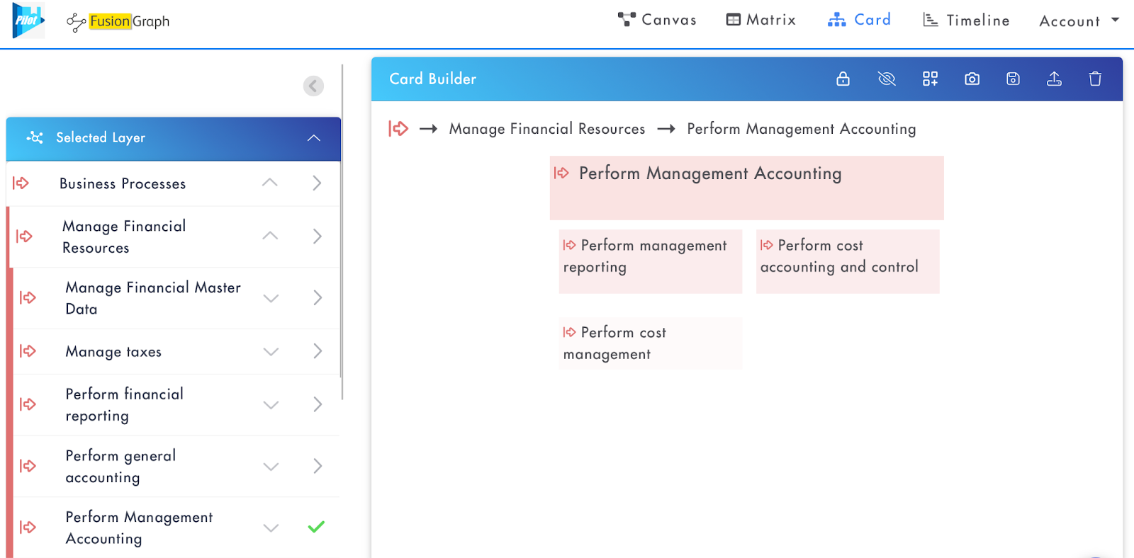
Navigating the Card Viewer via Breadcrumbs
Once you have added hierarchical data to the Card Builder, a clickable breadcrumb will appear, denoting the structure of the current view.

When a card is clicked the breadcrumb will change to reflect the structure of the selected item. You can navigate the card viewer by clicking an item in the breadcrumb to open a view of that item and two levels of it’s children.

Clicking the icon in the breadcrumb will take you back to the top level of the data.
Organising Cards
To make card structure changes easier to manage, unlock the card view for editing 
- Reorder mode - Allows a card to be dragged to any position (marked by the grey line) under their current parent, ie vertically within the level 3 stack or horizontally witin the level 2 row.
- Reparent mode - Allows a card to be dragged and moved to a new parent item which will be highlighted by a red card outline. The purpose of this is to drag the item to the card that you want it to be a child of, as opposed to where you want it to sit position wise, ie not in between cards.